Good goal is to design a UI with less UI-ink. We try to determine our UI-ink ratio via:

Part 1: https://xafmarin.com/xaf-myth-1-ui-is-not-customizable/
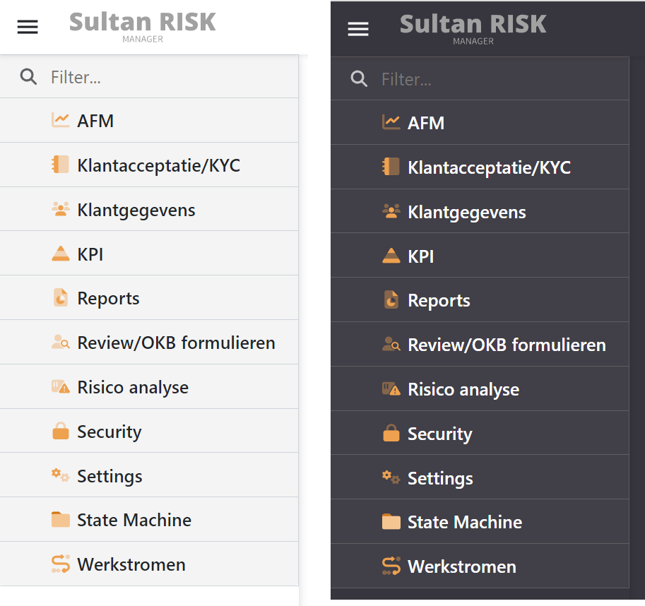
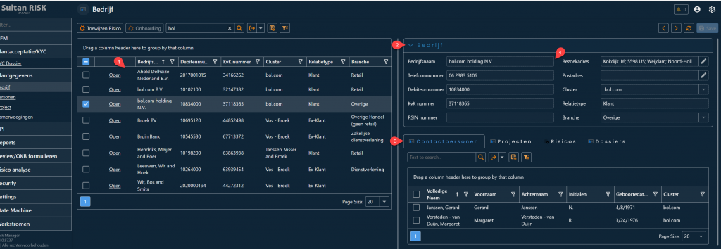
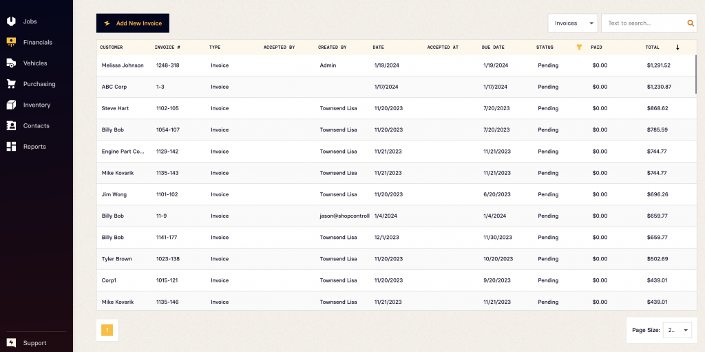
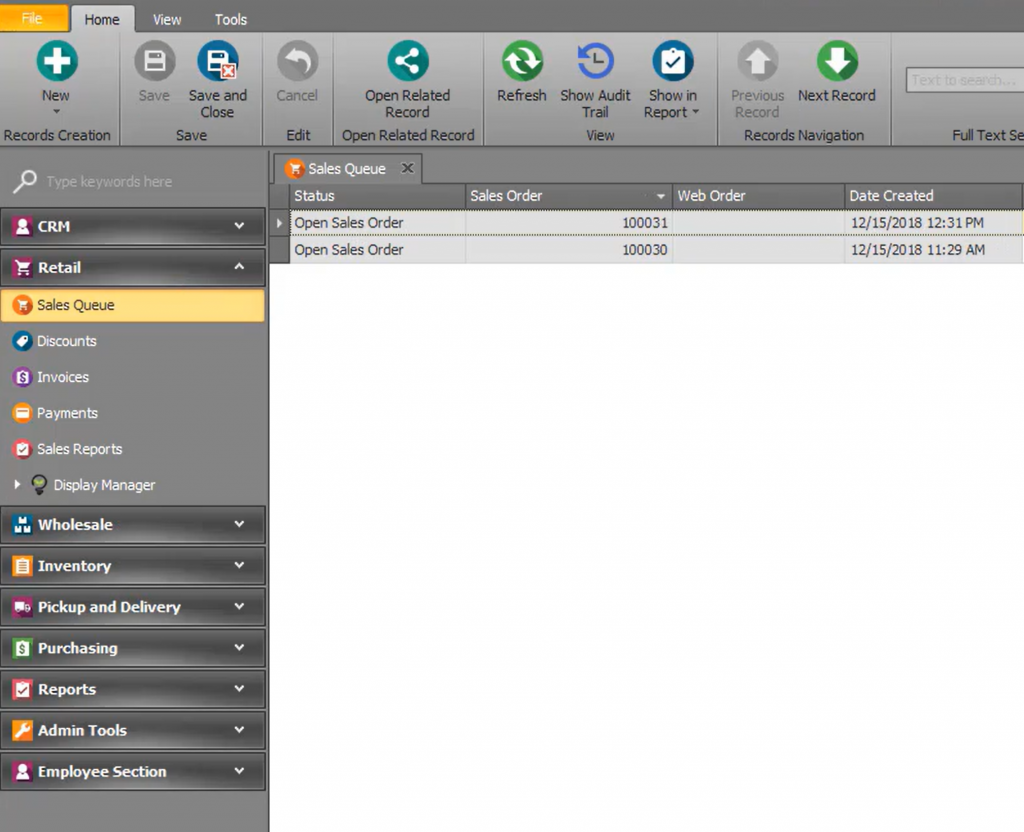
Navigation modified where > and V symbols have been removed and master navigation items no longer show the folder icon. Via model applied.
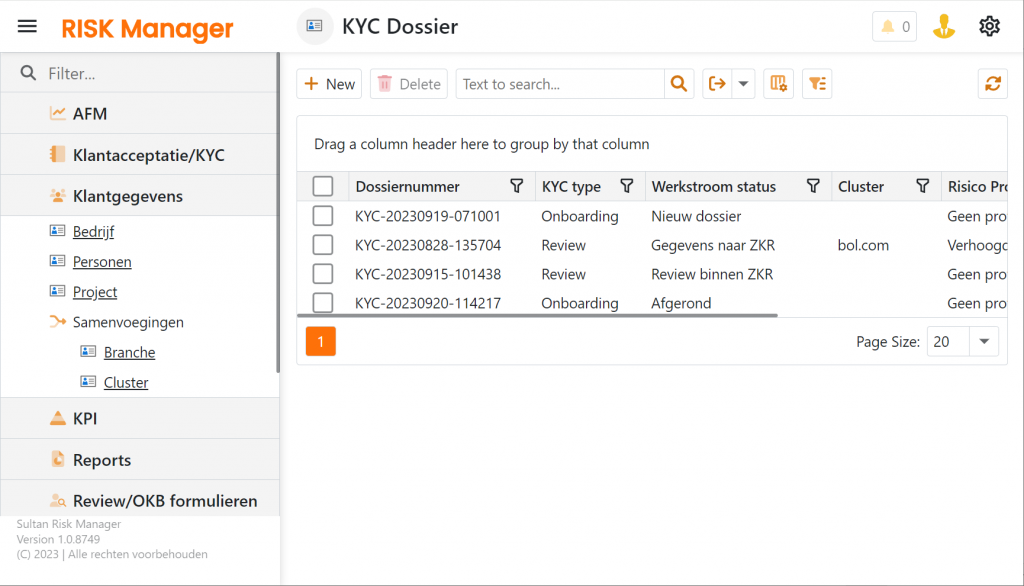
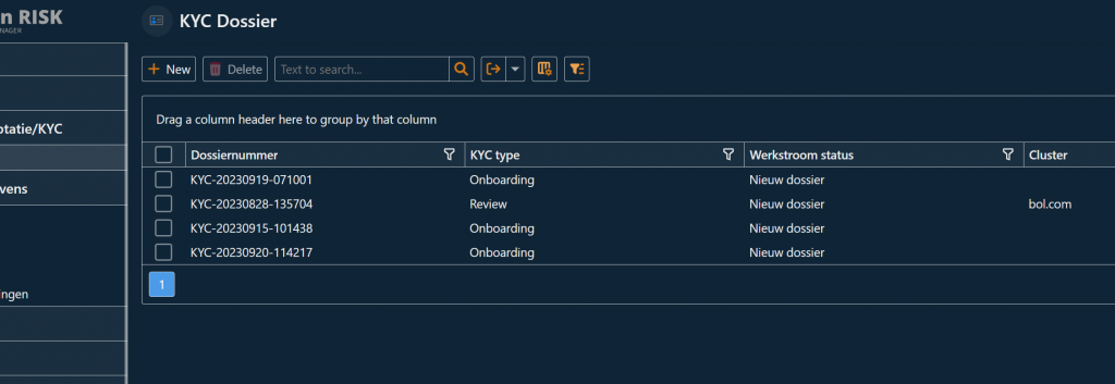
The grid no longer shows inner lines (css fix)
Before grid line removing…
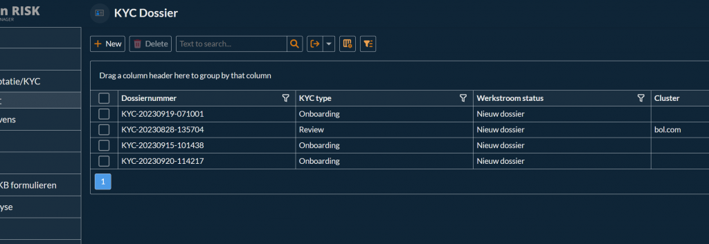
After grid line removing…

#2 Font based on input our designer + letter spacing boosted making this stand out a bit more.
#3 Same as #2 for tabs
#4 Data entry box pushed a little more to the background to make it less present.
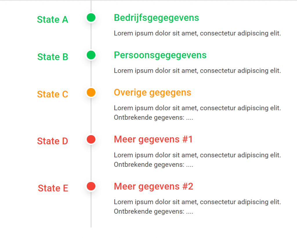
Vertical timeline to visualize state transition’s and current state…
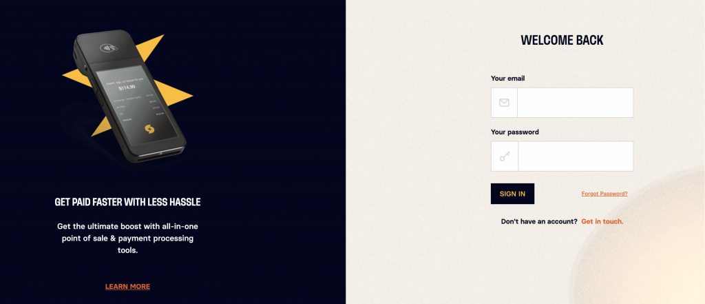
Custom Login
Custom Navigation
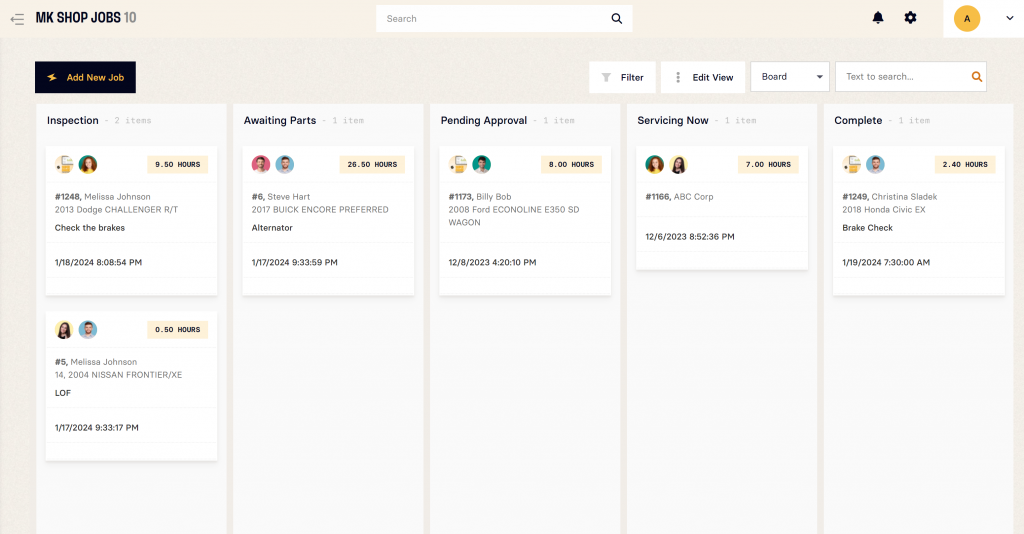
Kanban Board and Top Header Search with Notifications
Custom Grid Cell Template
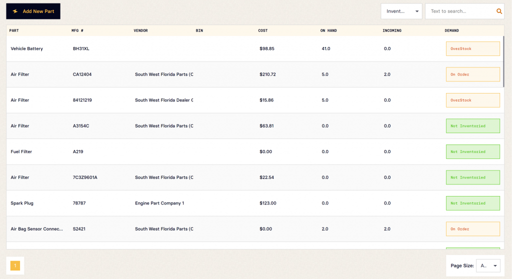
Custom Property Editors in DetailView
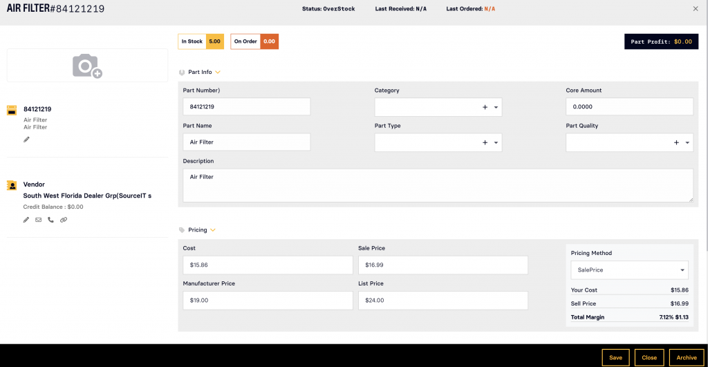
Custom Property Editors in DetailView Version 2
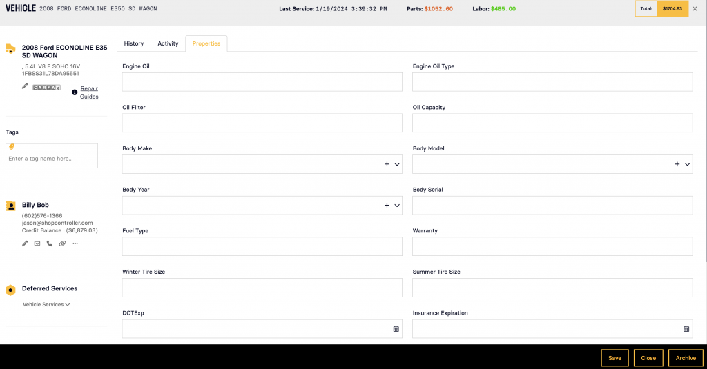
Custom ListEditor
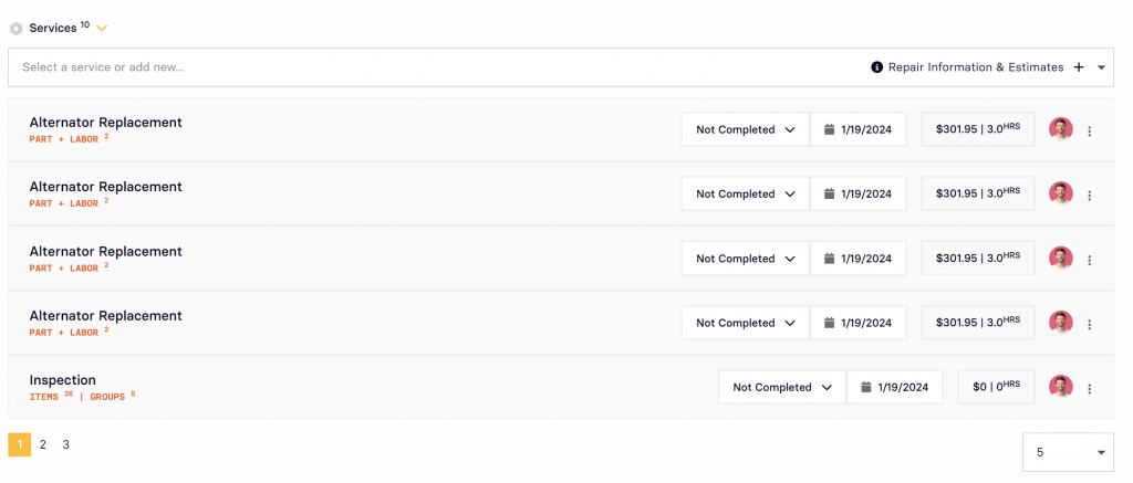
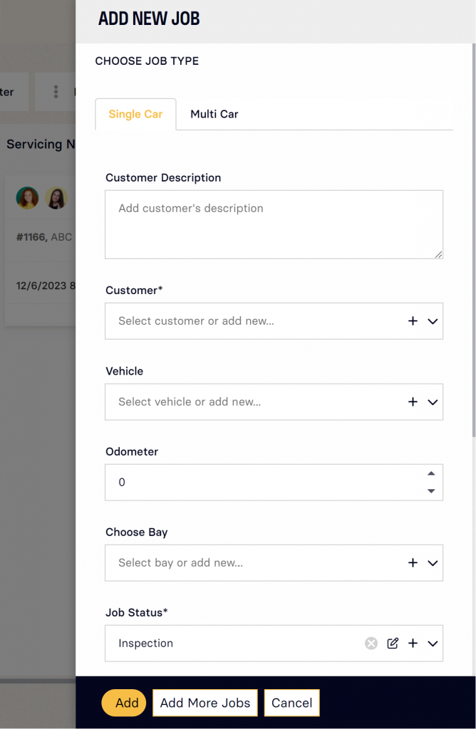
Custom Popup
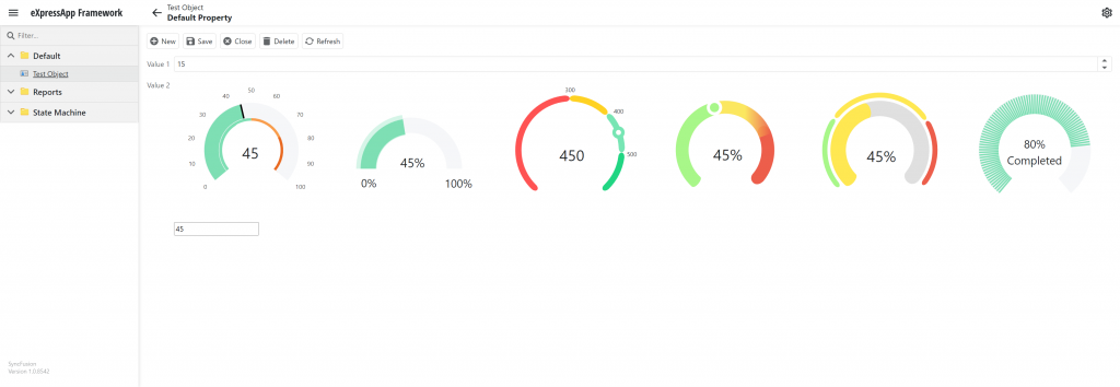
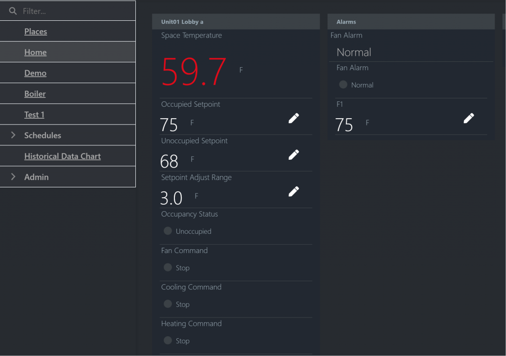
Custom Widgets (iOT App)
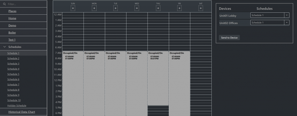
Custom Scheduler
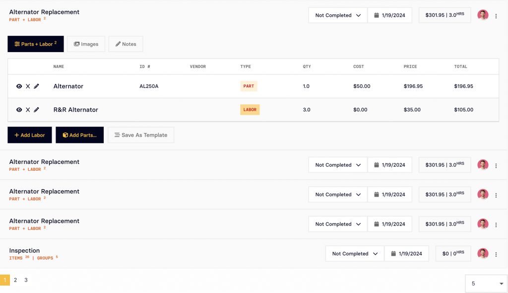
Custom Listview with Left Panel for filtering

Custom Login 2
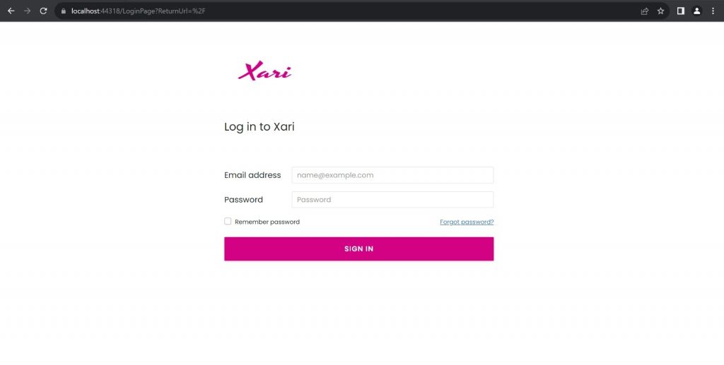
Custom DetailView Version 3
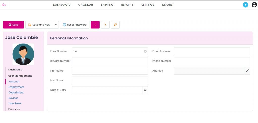
Custom Navigation and ListView with Custom Filters and a Custom Top Action
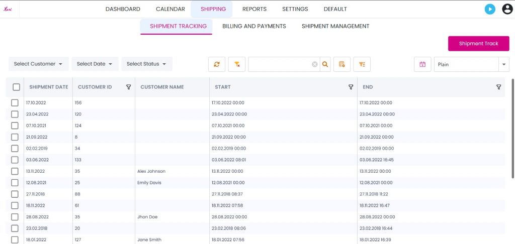
Custom Navigation and Order Processing with Shipment Tracking State
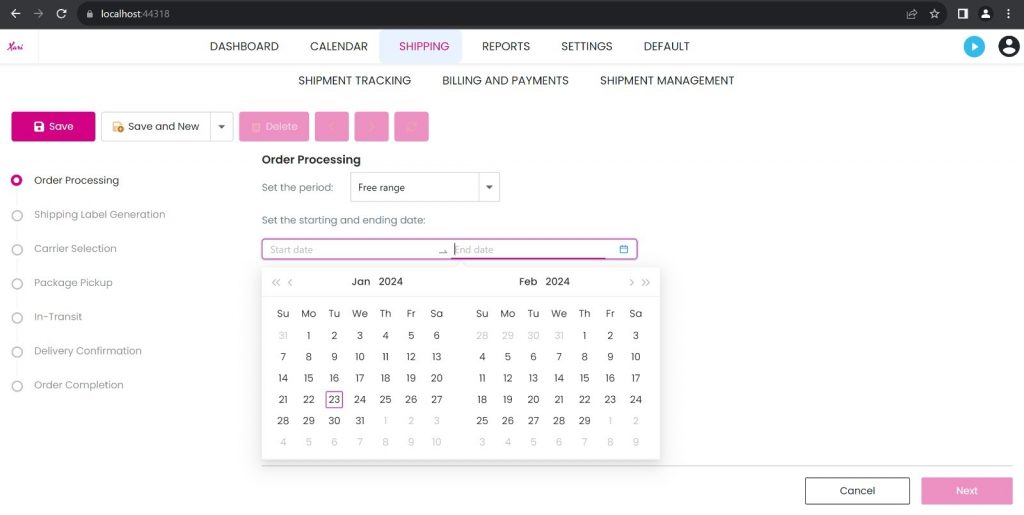
Customize Action

Customize Action 2

Custom Icons
Another Custom Property Editor
TokenBox

XAF WinForms Custom Editor

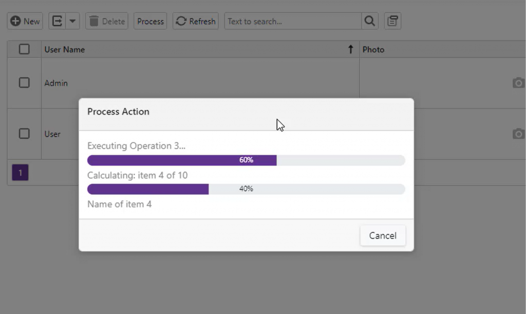
XAF WinForms Progress Bar

XAF Blazor Progress Bar
